E’s Affordable Luxury Lifestyle · The Fall Edit
Fall Matching Sets & Pajamas That Look Put Together
Easy matching looks, thoughtful textures, and pajamas with a little more polish.
This post contains affiliate links. As an Amazon Associate I earn from qualifying purchases.
There’s something satisfying about an outfit that already works together. This edit starts with textured matching sets, then moves into the pieces for winding down: classic stripes and contrast-trim pajamas. Each style has its own place here, with a few selected colors to keep the list easy to browse.
01 · Matching sets
The Matching-Set Edit
A relaxed starting point for a fall look. Style the pieces together or use the top as the beginning of another outfit.

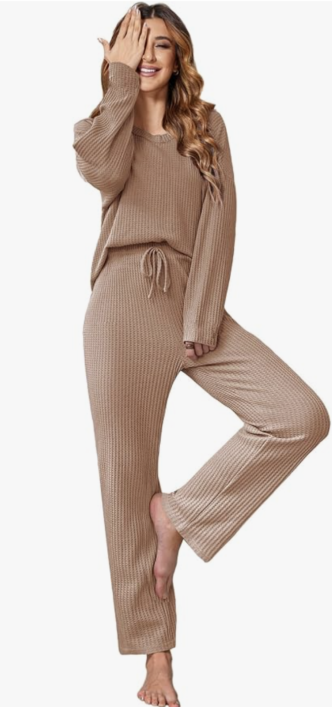
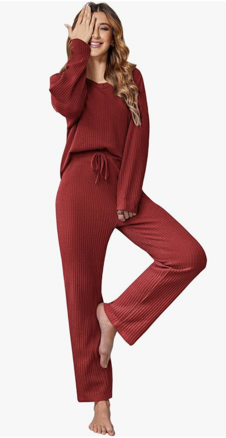
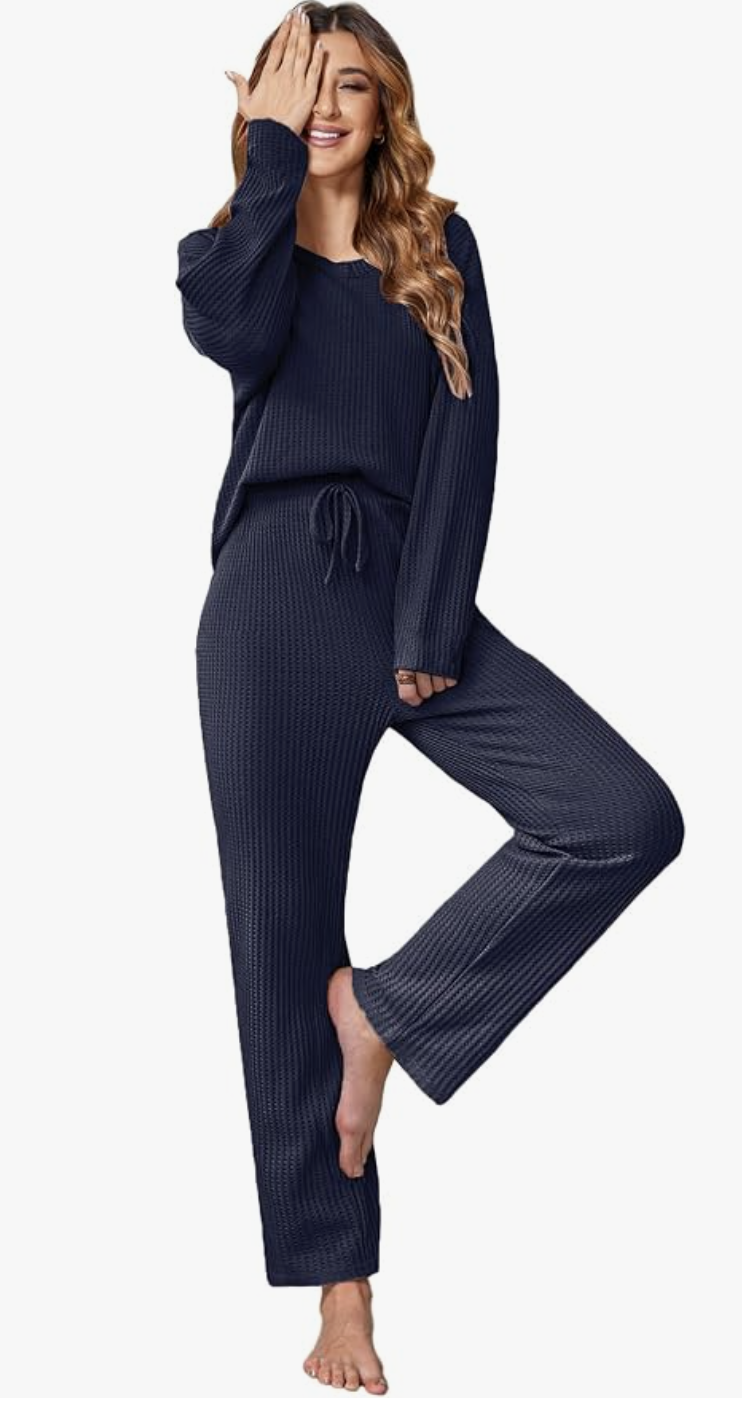
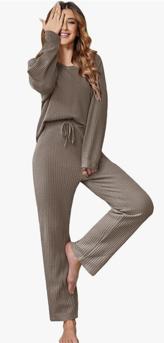
The Waffle Matching Set
A matching set gives a relaxed outfit a sense of intention. The waffle texture brings interest to a single-color look, while the simple top and matching trousers leave room to style it your way.
The colors I’d show: Lead with gray for the bedroom edit; show the brown option alongside fall styling. The blue makes a good alternate when you want more color.
Styling note: For a daytime styling idea, add clean sneakers and a structured bag. For a night in, keep the matching pieces together and let the texture do the work.
02 · Pajamas
The Pajama Edit
For nights in and slow mornings: matching pajamas with clean lines, strong colors, and details worth seeing up close.

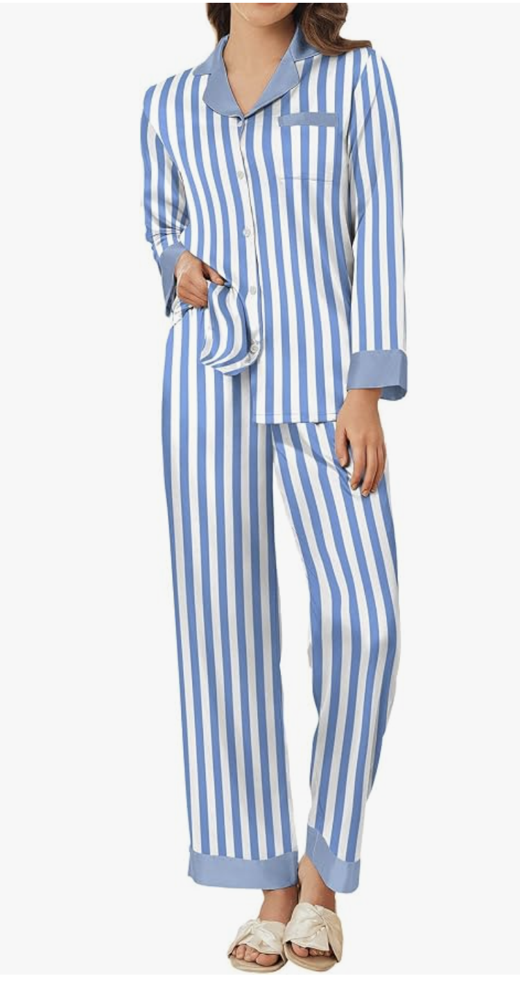
The Classic Striped Pajamas
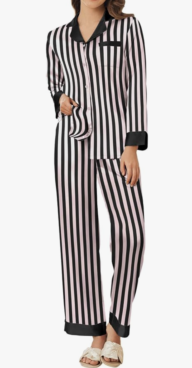
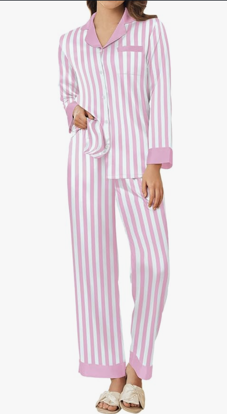
Navy-and-white stripes have the crisp, collected look this edit needs. The contrast collar and cuffs give the matching shirt and trousers definition against white bedding.
The colors I’d show: Navy stripes are my first choice for the main image. The lighter blue stripe is a fresh second option.
Styling note: Keep the bedroom styling simple: white bedding, dark wood, and warm lamplight. The stripes already supply the pattern.

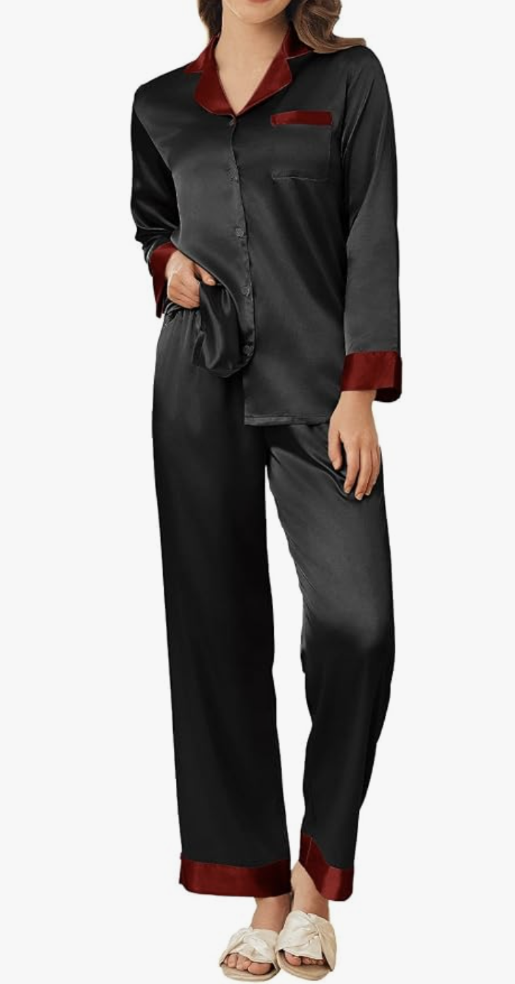
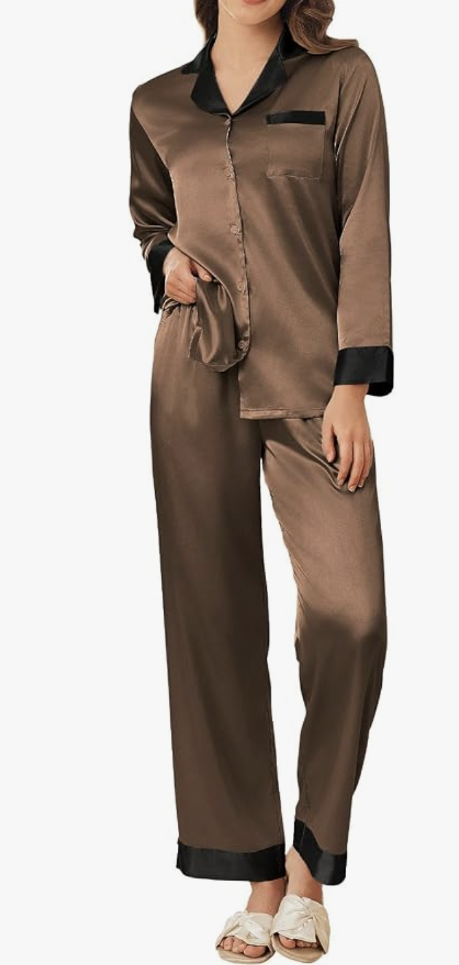
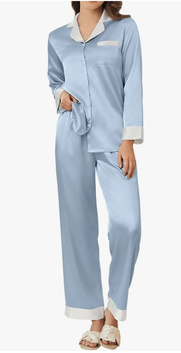
The Contrast-Trim Pajamas
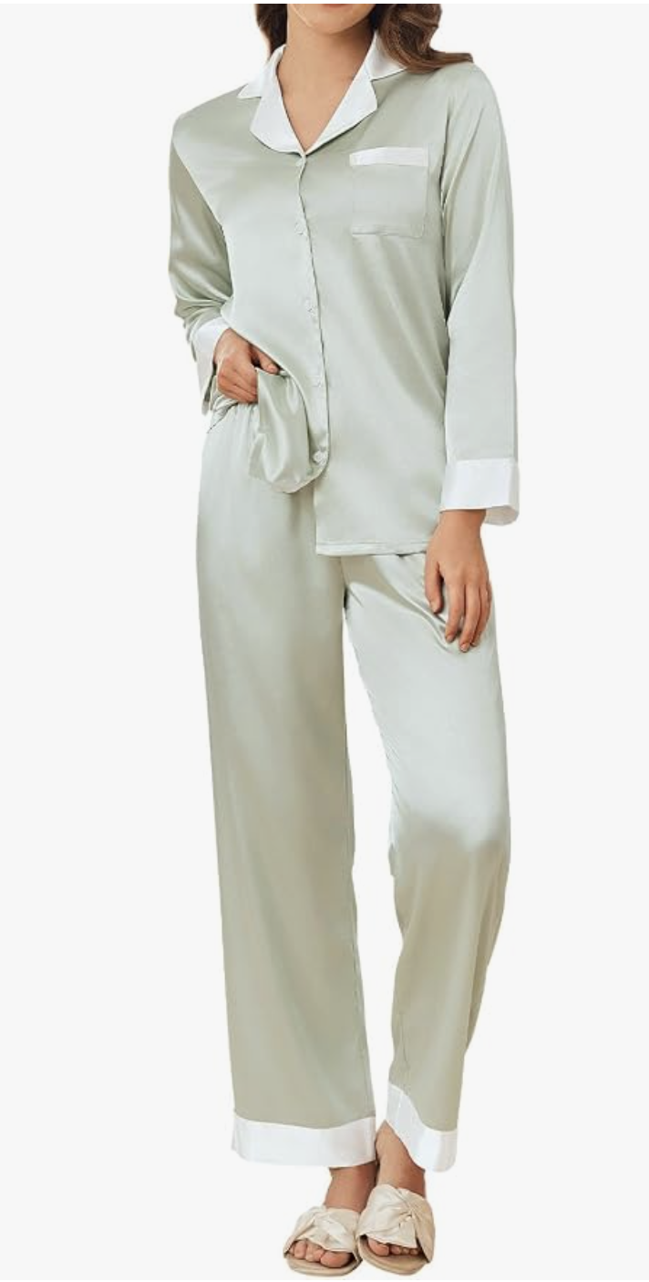
Emerald green with black trim is the richer choice for this roundup. The clean contrast around the collar, pocket, cuffs, and hems gives the set a dressed-up appearance without complicated styling.
The colors I’d show: Use emerald as the lead color. The pale green with white trim is a lighter alternative from the photos you sent.
Styling note: Photograph the full set against crisp white bedding so the green and black details stay clear.
A little texture, a deliberate color, and pieces that work together. That’s enough to make the everyday feel more considered.